Final eBook Pages

Above are my final e book designs. The only changes i made were the line spacing because the ingredients sections were a little hard to read being so close together. I’ve kept a link throughout the pages by using photography and the same type faces in a handwritten style font that adds a personal touch. I wanted the designs to look fresh and vibrant as i was inspired by the food photography i looked at within my research, whilst creating a link to outdoor cooking using a cob oven. I did this by buying different types of slate to add a rustic feel to the design, i think this worked well and created a nice backdrop to my images. The front cover conveys someone who has freshly baked their pizza in the cob oven and i’ve positioned it to look as thought the audience is being offered the pizza making it more inviting. The back is an aftermath of the front and shows the remaining few pizza slices after it has been eaten by one or many people. The photography and text work together creating an element of play. I’ve designed the imagery to work around the text, drawing your eyes in and creating an even balance between the two.

Final Artifact With Applied Art Work

Above is my final artifact with the seed paper design.

I took a visit to the Worcester Resources Exchange shop which is now newly located at Blackpole Unit F9, Blackpole East, Worcester, WR3 8GS . The shop definitely took some finding and once found i bought myself some card to use to make my pizza box. I decided to make my own box as i couldn’t find blank ones to use and also ordering a pizza box wasn’t an option because i would have to buy in bulk which would leave me with 100 pizza boxes! Therefore making it was the best idea and also i had the option to choose the measurements.

The box would be made out of recycled, bio degradable materials and the paper sleeve would be embedded with basil seeds. To represent this i’ve added seed like dots to the design. The vibrant illustrations brighten up and add life to the design, the text is also legible (but did bleed a little when printed which i couldn’t help) it promotes healthy eating and sustainability whilst creating a nice link between using the cob oven and the allotment.

The inside information is displayed in 3 simple easy step by step instructions. I’ve added this information as a mock up, this would be printed onto the inside of the packing.

Benefits

  • Sustainable
  • 100% recyclable and bio degradable
  • Works within a closed loop cycle
  • Students are able to grow their own basil once finished with the packaging
  • 0% waste
  • Environmentally friendly, no pollution, not harmful to wildlife
  • The design is fun and vibrant
  • Promotes healthy eating and links to the allotments food growing role

Seed Paper Development

Above are examples of seed paper sizes for a 7 x 7 inch box ( I mistakenly wrote 5 x 5in on the images). I’ve edited my paper design onto an existing photo of a pizza box to help give me an idea of size. I decided that i liked the 2nd measurement better which is 4inches across as I felt that it was a nicer balance between the paper and the box. I also looked into the color of the box, I’ve decided to go with the brown as it gives off an organic feel.

Above are the development stages for the seed paper design that is to go around the pizza box. I started out experimenting with type layouts and background color. I decided that the black was too intense and not as sustainable as the white because more ink would have to be used. The images show the subtle changes between type faces/ sizes and text positioning.  I printed each page out to see in person whether the layout worked and by doing this I made the decision to expand the width of the seed paper from 3 inches to 4 inches because the design didn’t look big enough. I managed to final it down to two designs which are displayed in the first image. I think that the information displayed at the bottom is neater and much easier to read on 2 lines rather than 3 or 4 with different lengths. I’ve also highlighted that the seed paper contains basil seeds, this is so it stands out amongst the text as it’s an important part of the design. I’ve highlighted the word basil in green and also by changing the font. The slogan has two designs, both with the same font all but for one word regrow. Placing the word regrow in a different font to the rest of the slogan adds a fun element to the design but it also makes the word regrow look separate. This isn’t what i want because the slogan represents the important stages the packaging goes through and all stages are just as important as each other. I think the second design shows this and therefore is my chosen layout.

E Book Development

Above are the first stage images where i was experimenting with typography placement within a few different photo compositions. I also edited the photograph of the pizza, making it brighter and aesthetically more appealing.

After i upload the previous images onto a MAC computer they looked rather dark so i went back and lightened the image a lil more. I thought the photo used in the examples above gave the impression that the viewer was being offered the pizza, making the cover more inviting. It also gave me enough room to add text without it interfering to much with the image of the pizza. I experimented with different type fonts to see which worked best and i’ve narrowed it down to image 5 & 6. I wanted a handwritten feel to the type as i felt it added a more personal feel to the design. The overall theme for this front cover was that the pizza has freshly been taken out of the cob oven.

Above are the two slightly different design for the 2nd recipe page. I wanted the background for this page to be rather simple as more information had to be displayed on it. I thought adding the flour on the background would add a nice subtle link to the bread recipe but on the down side this made parts of the text a little harder to read. I tried using a background without the flour but i felt this looked a bit plain compared.

page 2 recipes finallllll

In the above image i have added a slight burn to some areas using Photoshop which has made it easier to read the white text.

PIZZA PAGE 1 final

Above is the near final pizza recipe page. I wanted the page to be vibrant surrounded by optional toppings for your pizza along with the ingredients for making the pizza dough. It was difficult to judge where to place certain items but i think i succeeded in creating a nice balance between the image and text, also the way the food is placed draws your eyes down towards the recipe.

The above images are possible compositions for the back page. I wanted it to look as though the pizza on the front cover has been eaten and now all thats left are a few slices. I thought this creates a nice link between the front and back pages.

Above are my final two choices accompanied with my final design for the back cover of the ebook. I wanted to keep a link between the back and the front and thought the design i’ve chosen allows me to apply text and information clearly while creating an element of play between text and image.

Above are a few sketches where i started to think about the shape of the take away/ pizza box and also how i would display the information on the seed paper. I think the traditional pizza box shape will work best for my artifact because it links to one of the pages i’ve designed within my ebook and also the front cover.

VE EMILY final print with text v1ggg

Above is a rough design of how the text might look. I tried to find a legible hand written font for the seed paper design. Although this type face is fun and works nicely it’s not the same font as the ones i’ve chosen for my e book. I’ve chosen not to use this font as i want to create a link between my e book and artifact.

Recipe Pages

Above are some existing designs that I found inspiring. I started to look at the way the food is placed to frame the typography, the lighting and also the angles in which the photos are taken.

Below are a couple of blogs that I found helpful to do with food photography…

https://www.bloglovin.com/blogs/click-it-up-a-notch-2642980/how-to-use-backlighting-for-food-photography-4170279374

http://simply-delicious-food.com/2014/03/14/food-photography-guide/

SCAN0154

The sketch above is what inspired me to use photography for the e book pages. I started to find images that inspired me and that were similar to what I had in mind for my own designs. I want a rustic outdoor cooking feel to my images so I started to look at textures, different types of wood and stone for a backdrop.

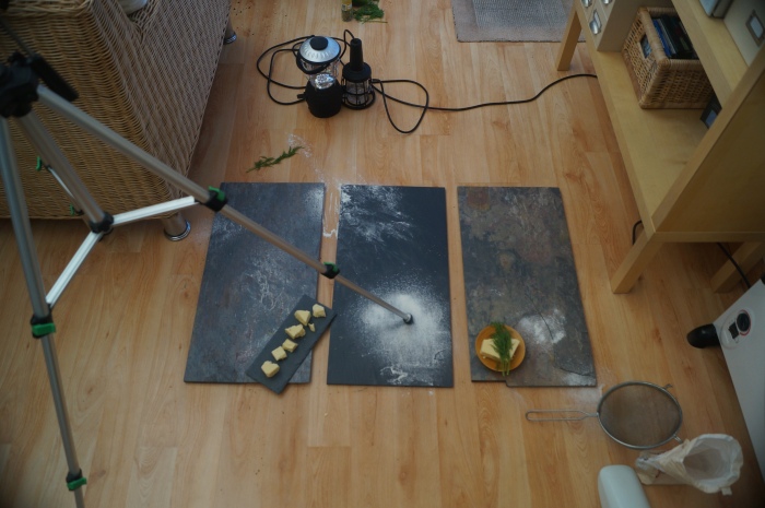
As i didn’t have any materials that i could use i went to B&Q to look for textured backgrounds. I picked three sample slates that i thought would work well, this also gave me the option to mix and match. I didn’t end up picking any wooden textures because i decided that the rustic looking slates fit with the theme I’m going for much better.
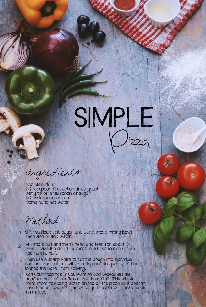
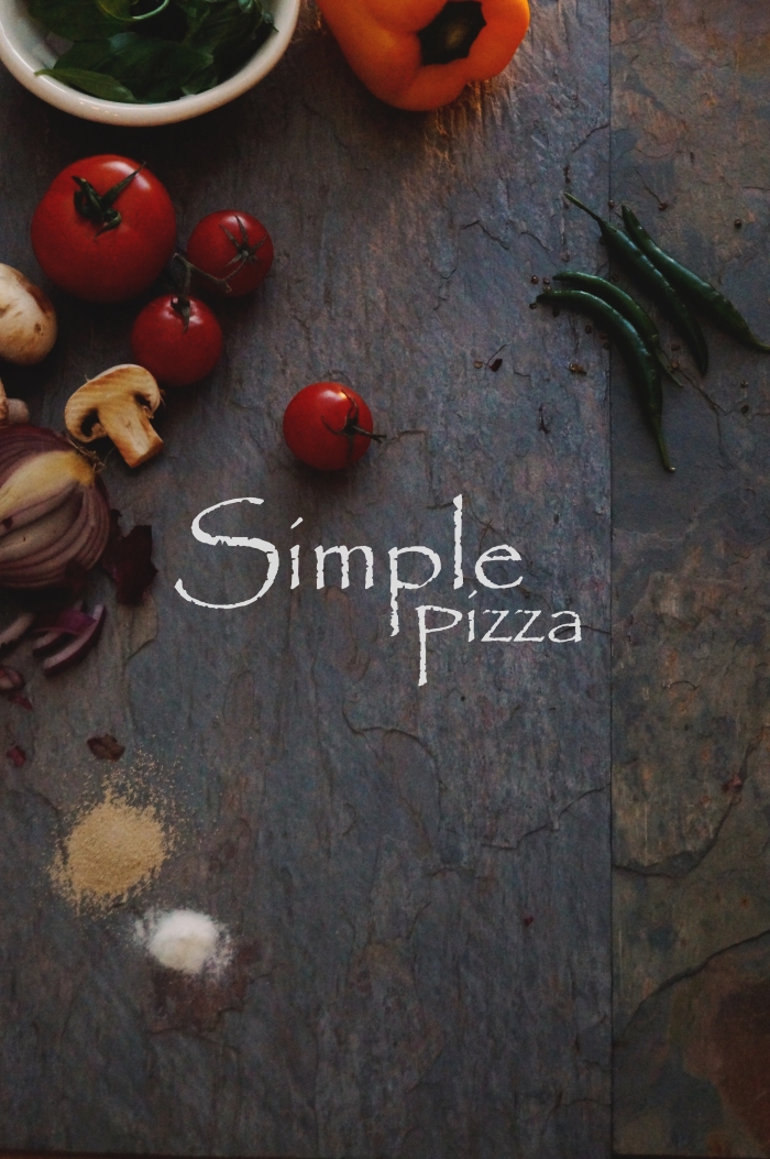
Pizza Page Set Up

Above is the recipe page set up

Below are some process shots of how i created the background for the pizza recipe page. I had a few issues due to lighting and focusing. As i didn’t have any specialist equipment i had to use the natural light and this sometimes worked in my favor or didn’t. Whenever it was cloudy this created a problem for me as the images turned out quite dark but it wasn’t a huge problem as i was going to further edit these images in photoshop.

Adding example Text

photo imple pizza

Above are some test shots, these turned out slightly darker than expected. I tried to see what I could do in Photoshop to make the image that bit better whilst also experimenting a bit with the typography to get a rough feel for how the design might look.

2nd Recipe Page

DSC07331.JPG

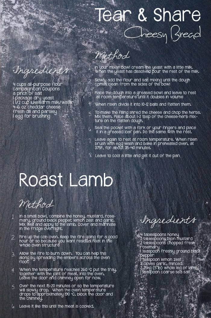
Above Cheesy Bread and Roast Lamb Recipe Page Set up

Above is the background photography for the 2nd recipe page. I wanted this page to be quite minimal as i wasn’t going to have much room on the page having two recipes on it. So i picked out elements like the flour, cheese and herbs that would be included in the ingredients, subtly linking the two together.

Front and Back Cover

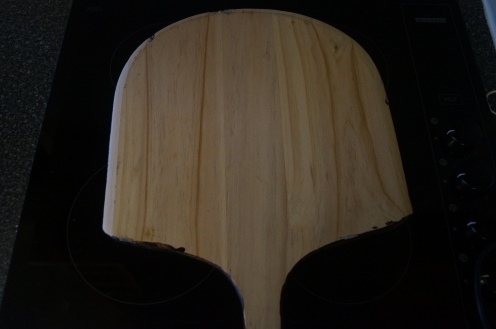
I decided to go with the sketch i talked about earlier in this post so i ordered a pizza peal for the shot of the front cover. When i ordered it the color was very light as shown in image 3. I wanted a much darker/warmer wood color to go with the rustic slate backgrounds so i bought a small pot of wood stain and painted the pizza peal. I felt this color worked much nicer and would bring the pizza into focus more.

DSC07307

Making The Pizza!

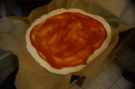
I followed the pizza recipe that i’m using on my pizza recipe page, this gave me the good opportunity to see whether the dough bakes nicely, and it did! Below are photos i took of the process.

Front and Back Page Photos

In these photos i was playing around with layout for the front and back pages thinking about where the text would be placed in relation to the the pizza.

Refined Seed Paper Illustrations

Untitled-1

Above are a few of the final illustrations.

Above are a few ideas that I came up with for the seed paper.

My first idea was to keep it simple and involve patterns that represent seeds. I thought this looked quite dull and not very exciting, so that’s when I started to experiment with the prints I made. I played around and edited the prints in Photoshop until I came up with a design I was happy with.

The fruit and vegetables I chose are ones that are popularly used on top of pizzas like tomatoes, peppers and mushrooms and ones that I think students would often use within their cooking. I also picked them for the distinct shape/texture as my illustrations are simple they had to be easily recognisable.

VE EMILY

Above is the final pattern for the seed paper which will go around the take away box/ pizza box. The box itself is going to have no colour at all apart from a small bit of information on the lid which will inform the consumer about the importance of sustainability. Therefore my seed paper design is bright and vibrant, it’s eye catching and I’ve tried to go for a modern style that will appeal to students. The design links to organically growing your own vegetables/ herbs which the packaging design encourages students to do.

Above is a VERY rough placement of where I would like the typography to go. I tried the rough layout on all images to see the comparison, and my chosen illustration works a lot better, I think this is because there Is less white space therefore the white circle for the text sits nicely within the illustration.

Typography & print Roughs

I Started to think about how I want the typography for the title/ headings to look on my designs. I know I want a hand drawn feel to my type as I think that will add I slightly more personal touch to the design. As I found out typography is rather difficult without a stencil or some kind of guide so these are just a few practice examples which I will perhaps further edit a few within photoshop.

My e book pages are going to be photography based on a wooden backdrop so I started to experiment with the idea of type drawn into the flour adding a playful element to the design. They look a bit too simple at the moment so I’ll most probably try using a stencil to help get a crisp and refined type face.

Vegetable prints

Above are some vegetable and fruit prints that I thought might look interesting for the seed paper design. I’m going to further edit them and draw back in to them using Photoshop to get a crisp refined look. I want the seed paper to be eye catching and vibrant, promoting healthy eating.

Cob Oven Build

(Photos by Andy Stevenson published on the Gdes3003 module blog)

Above are a couple of photos (not my own) showing me and my peers taking part in the cob oven build that took place on the allotment site at the University of Worcester. To make cob you have to mix sand and straw, it has been a common building material for millions of years all across the globe.

To make the cob mixture you need 25% clay and 75% sandy gravel. Before applying it to the cob oven build its thrown down onto a mat and mushed up with our boots until it becomes a smooth and even paste.

We then roll a handful up into a ball and build around the dome, making sure not to pat/ mould the mixture too much as it brings water to the surface, this could effect the way the cob oven dries out.

Why Aren’t Pizza Boxes Round?

Because it is simpler, cheaper and easier to make a square box than a round one (a square box can be formed from a single sheet of card ) and also it is easier to store, transport and pack square boxes which will remain in a flat state until needed and are quickly assembled at point of use. A round box by its very nature needs to be assembled from at the least four sections, or to be pressed to shape using special machinery. It also needs to be in two seperate parts, the container and the lid. Storing round boxes wastes space due to the unused volume inside, and the unused space between each box.

http://www.theguardian.com/notesandqueries/query/0,,-201008,00.html

The Ecodesign Strategy Wheel shown below relates a products life cycle to the ecodesign strategies.

strategies_stratwheel2


Roughs

Pizza Box Ideas

Above are some roughs for the 3D artefact images 1-5.

4 & 5 are my first ideas, after doing some research I started to think about how a pizza box could have a second use, how it could turn into something else. The idea that stuck with me was the idea of seeds embedded into the packaging box which then could be planted and in its place grows flowers/herbs/vegetables. The box would be made from recycled and compostable materials and when planted in the ground over a short amount of time the box would decompose resulting in absolutely no waste. I think this idea would be mostly suited as the students who use the cob oven will be sustainable and passionate cooks.

Images 1-3 are my rough designs of how I could introduce seed paper to the packaging design. I thought a strip of seed paper would be best wrapped around the box which would have the instructions/ directions written on of how to plant the seed paper.

Image 3 I started to think about eating on the go and how the box could be designed to be hand held. This idea was short lived and it quickly came to my attention that a student or anyone eating on the go is most likely not going to save the packaging till they get home or wait until they find a recycling bin but instead throw the packaging in the next bin they come across meaning the whole idea of the reusable packaging has gone to waste!

Seed Paper Design

Above are images 1-6. In these sketches I was thinking of the design I want the seed paper to have, I started to think of patterns that could be associated with herbs/seeds. I would like the design to be quite bright and eye catching but also using a maximum of perhaps only 3 colours. I also thought about how I could interlink my slogan Recycled Reused Regrow.

Recipe & Preparing Your Cob Oven Pages

Above are rough sketches for the layout of a recipe page and step by step instructions for preparing your cob oven.

Front Cover Ideas

Above are some roughs for the front cover. There are 2 designs that I want to further develop, The top sketches in image 2 and image 3. Image 3 would be photography based a birds eye view of a pizza that looks homemade and has been freshly taken out of the cob oven ready to eat. This then would have handwritten type, giving a personal feel to the design. I thought this style would be suited to a mature audience and also promotes outdoor sustainable cooking!

My second idea that I would like to develop further are the top sketches in image 2. This design would be illustrated within a mosaic like grid, each square would have an illustration associated with cob ovens/food/social events and centred the title with an illustration of a cob oven.